Demi Moore has been in the news lately because of her starring roles in the movie The Substance and also for being a part of the F/X series Feud: Capote vs the Swans that came out earlier this year. It’s great to see her back on screens. Recently I was flipping channels (having grown up in an analog world, I’ve held onto having cableTV because I still enjoy the novelty of discovery through “flipping channels”) Anyway, I came across the classic 1990 movie Ghost, which starred Demi, along with Patrick Swayze and Whoopi Goldberg.
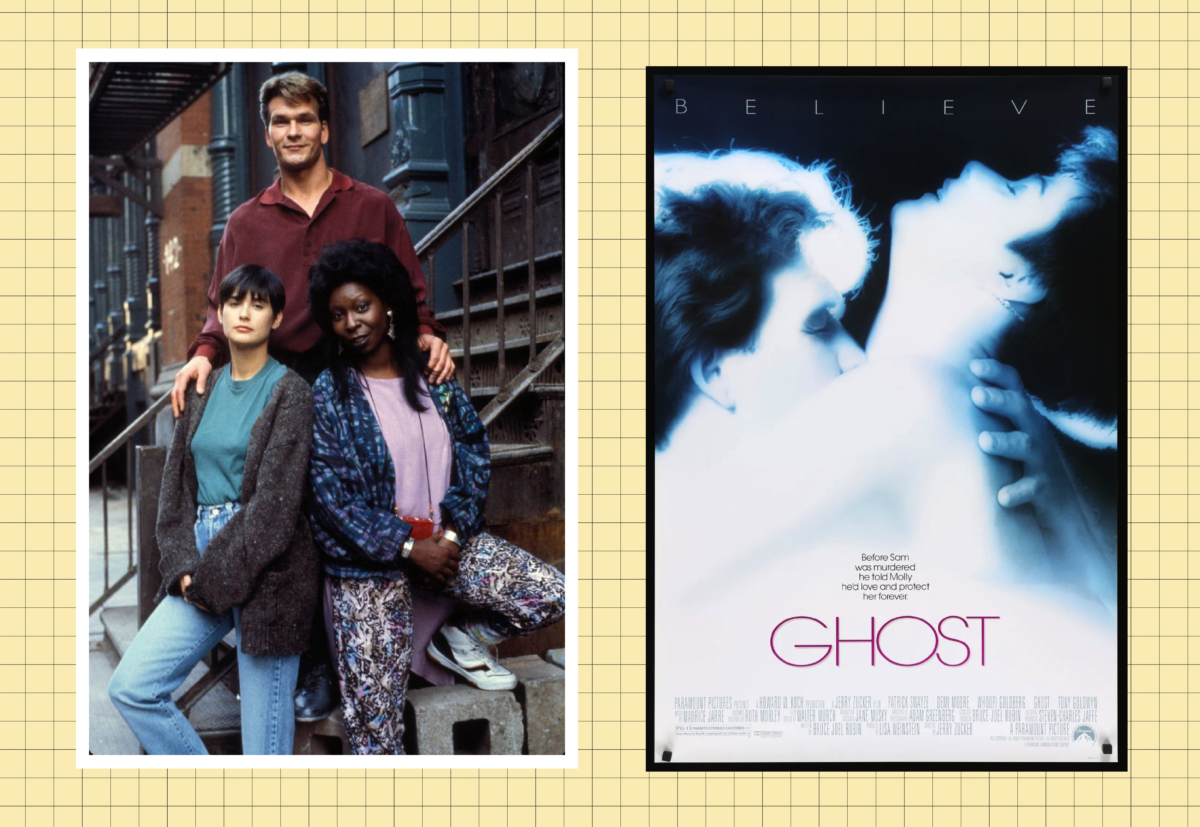
If you don’t remember it or were too young to have seen it, the plot revolves around Sam (Swayze) being murdered during a mugging and becoming a ghost. He watches over his girlfriend, Molly (Moore), and uses a con artist psychic, Oda Mae (Goldberg), to uncover the truth about his murder. It was a box office smash and won Goldberg an Academy Award for Best Supporting Actress.
OK, looking at it now, some 30+ years later, a lot of things (especially the “ghost” special effects) feel comically dated, but the story is still sweet, and the performances still make the movie enjoyable. Also, Demi Moore’s iconic short pixie haircut and tomboy wardobe styling in the film still hold up today. However, rewatching the film, I found myself really drawn to the set design and all the little details in the incredible loft where a majority of the movie takes place. It felt so… now?
First a little context, Moore’s character is an artist (who can forget the the iconic pottery wheel scene), and the beginning of the film shows Swayze and Moore renovating the loft, later revealing an incredibly modern and eclectic “artsy” space that was so idyllic of New York in the 80s and early 90s.
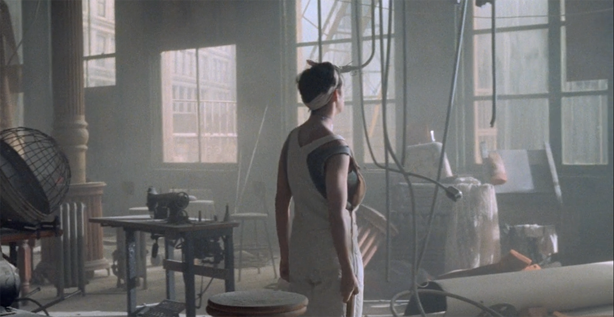
I immediately had to do a deeper dive…
Here’s a few immediate things in the loft that I need to highlight:
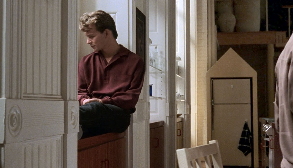
1) The first thing that caught my eye was the pyramid/triangle postmodern yellow refrigerator enclosure. Is it purely decorative and impractical? Yes, but .. it’s so fun and your kitchen should bring joy.
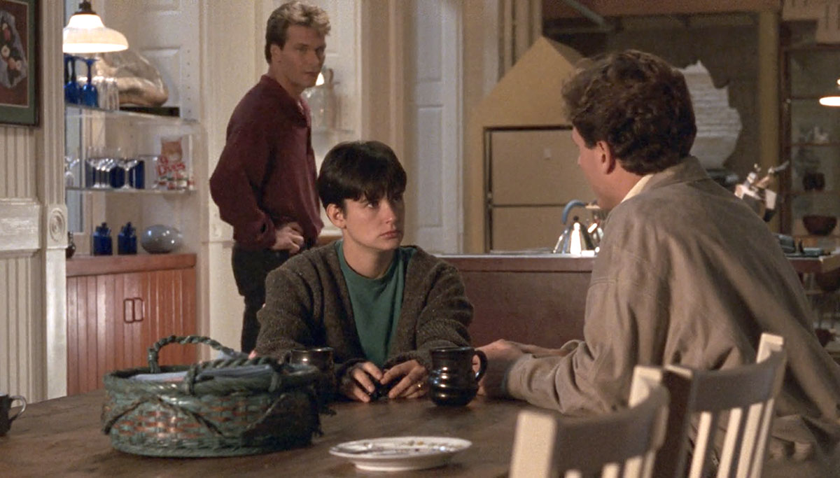
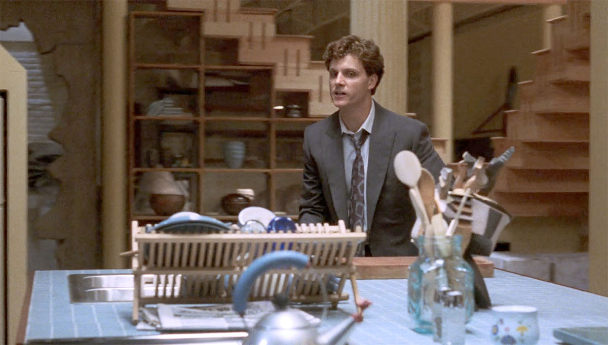
2)This leads to the rest of the kitchen: the open shelving that sits underneath the stairs, the blue tile on the countertop, the blue mason-like glass utensil jar, and most of all, the inclusion of the iconic Michael Graves “9093” kettle for Alessi. (I feel like that kettle was the go-to prop to add to any kitchen film/TV set during that era to make it feel “modern.”) I love the warm mix of everything.
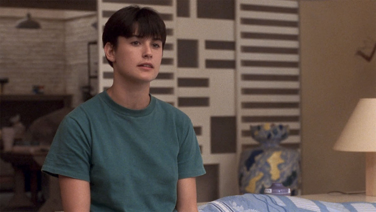
3) The folding screen divider with the rectangular cutouts is such a cool way to divide an open space. The pattern also makes it almost like another art piece
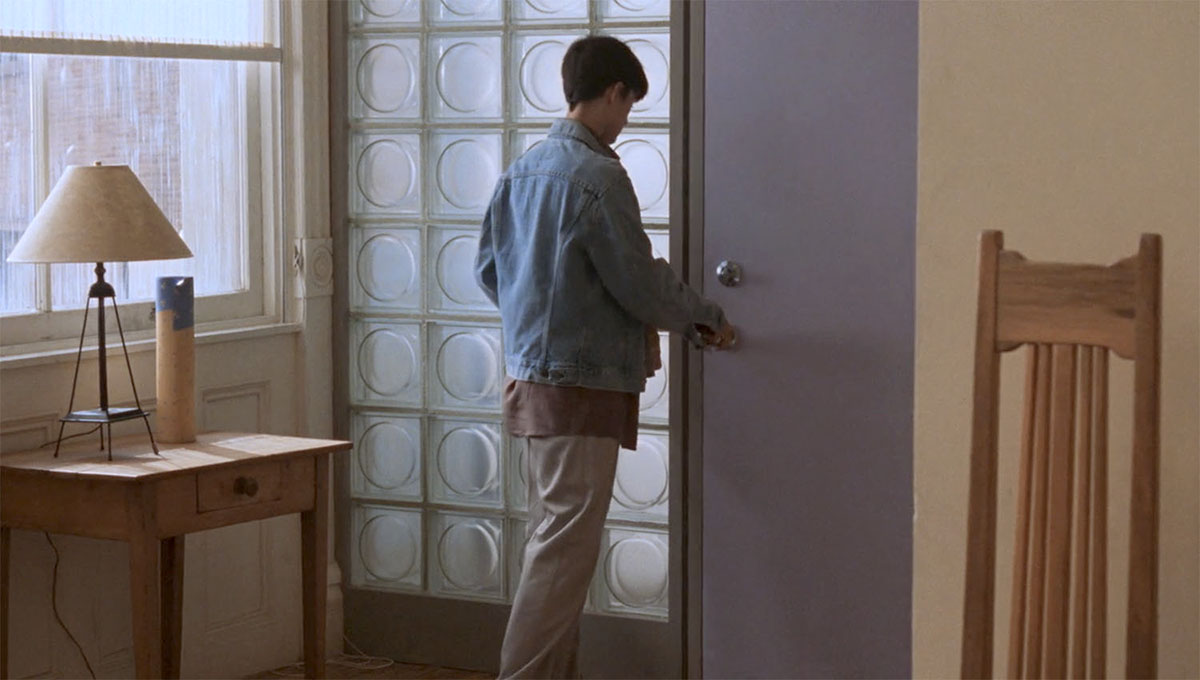
4) I have always loved a glass brick wall. It is such a symbol of 80s/early 90s postmodern architecture, yet I really like this version that was used because of the circle motif in the middle. It makes it feel a little deco or 60s mod.
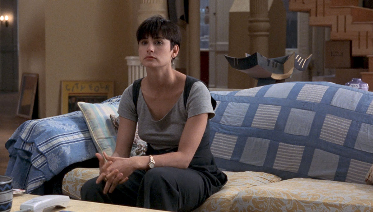
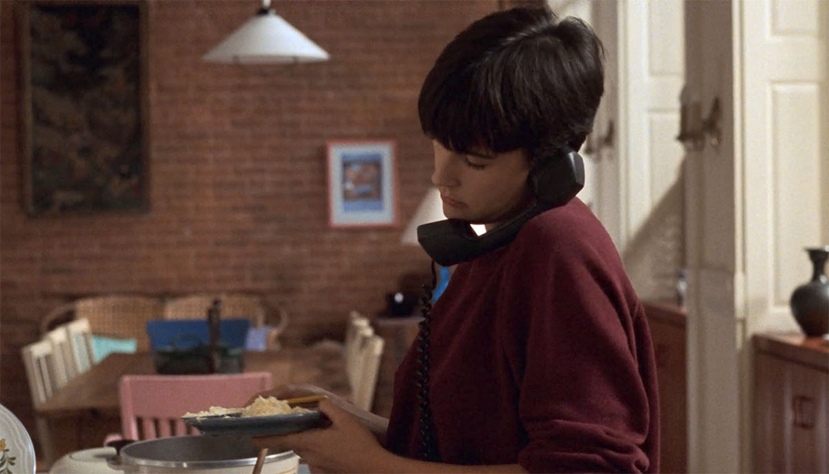
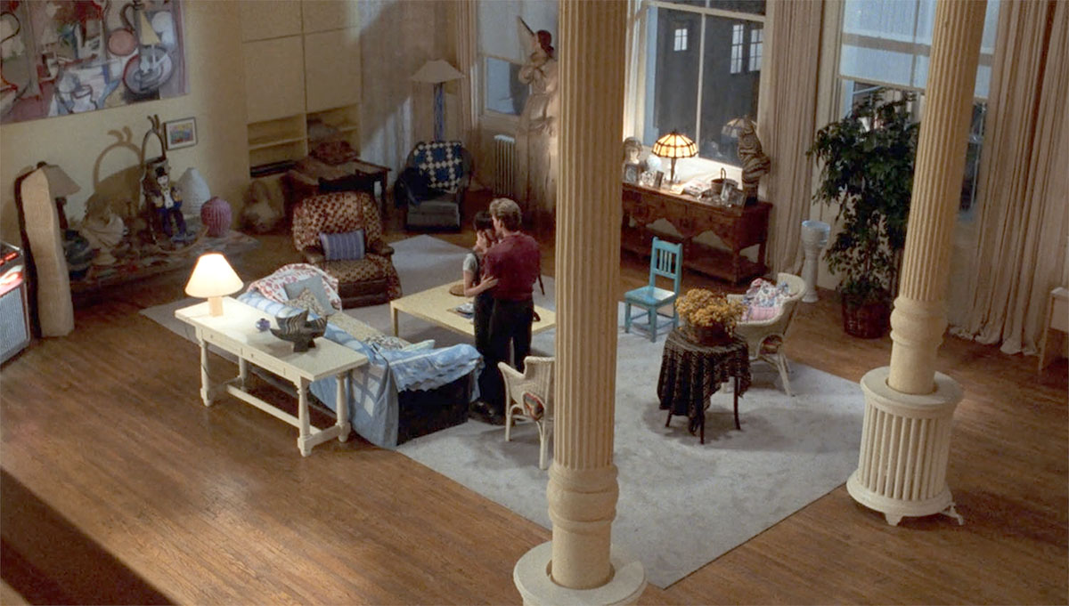
5) I was surprised that despite all the POMO details, the rest of the furniture was really country/cottage-y. Most of the seating was wicker or shaker-style pieces, and none of them really matched. I liked all the quilts and clashing textiles.
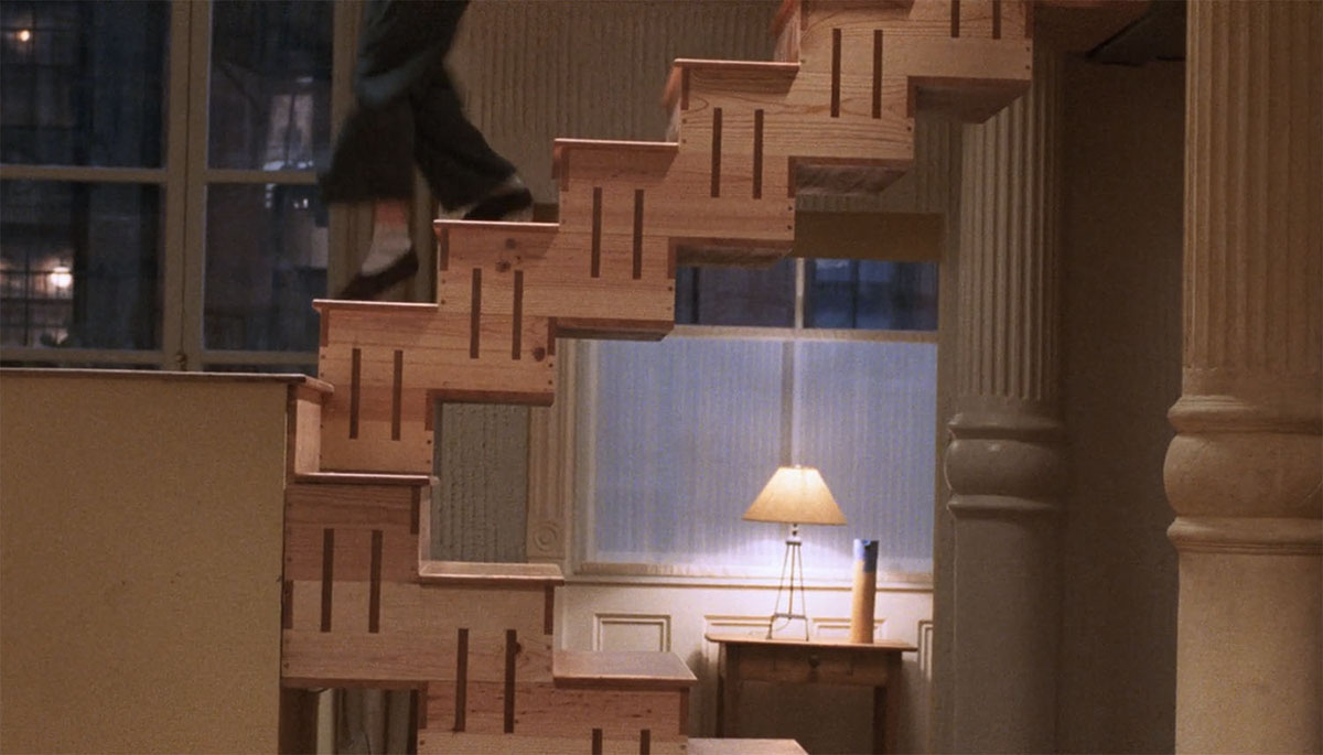
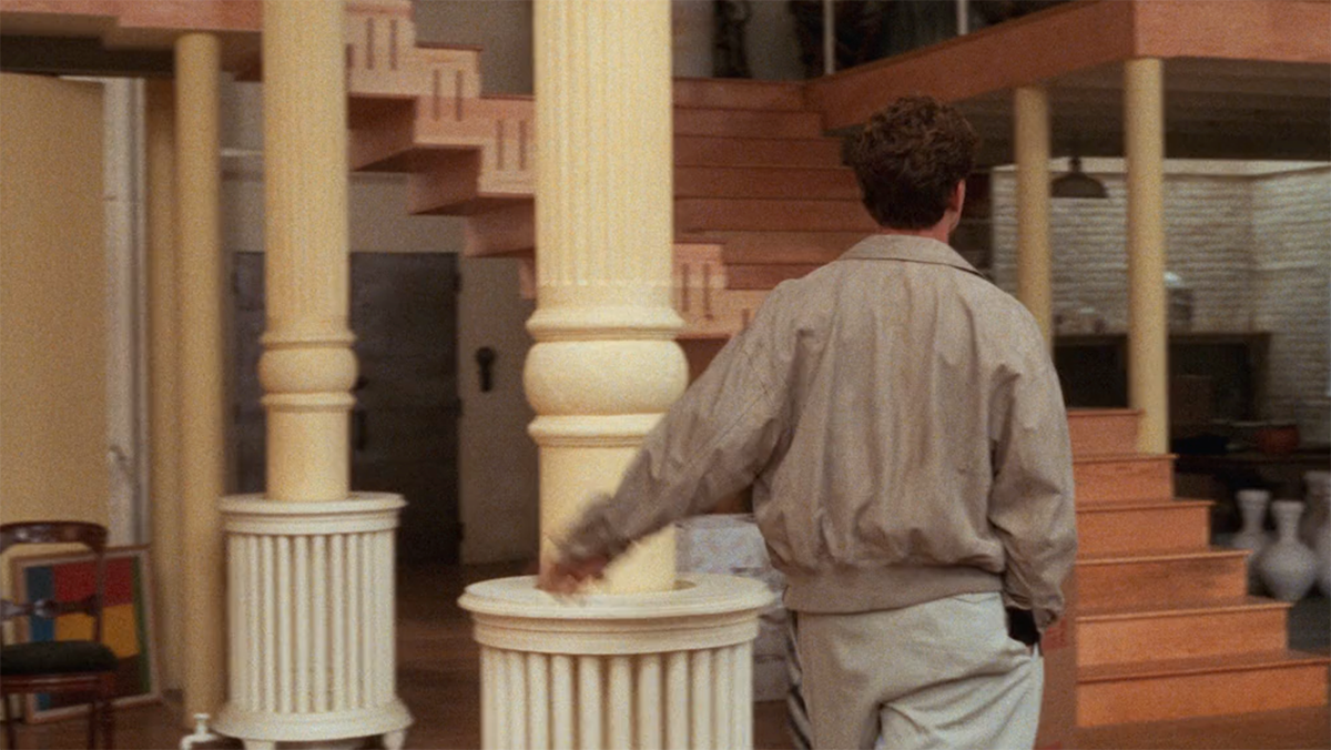
6) The open staircase is probably the most iconic feature of the loft. I know I would totally fall and have an accident if I lived with that kind of design (handrails, please!), but man, is it dramatic and so stunning!
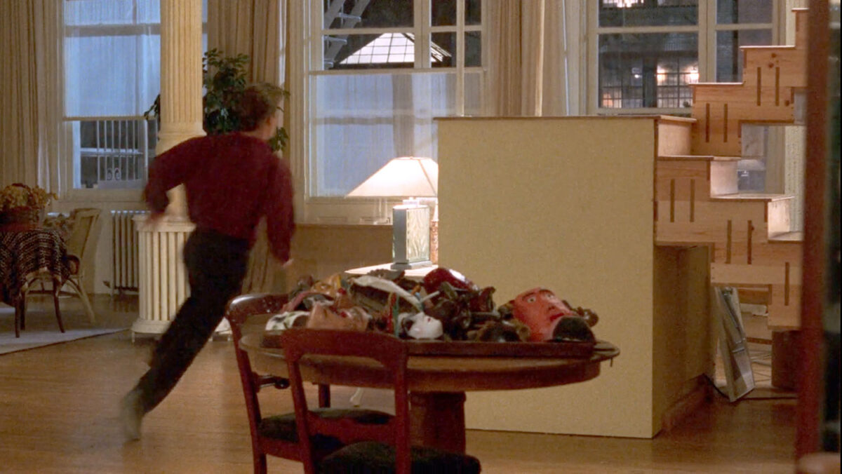
7) Finally, in a blink-and-you’ll-miss-moment in the film, I noticed this pile of folk art masks on a table. I assume because, in the story, Sam and Molly are still settling into the loft, so they probably haven’t unpacked everything. Anyway, I liked 1) folk art masks – which I’ve always appreciated as an art form and 2) displaying a collection on a table is a fun alternative to displaying them on a wall.
OK, so those were some of the key things that caught my eye while watching the film, but as I mentioned earlier, it prompted me to do a deeper dive.
After some googling, I found out that the loft was actually inspired by the real New York loft of artist Michele Oka Doner. It’s located in what was originally an old button factory. The story goes that the movie’s production team loved the loft and wanted to shoot there, but Michele didn’t really want her life upended, so she just gave them the actual architectural plans, and the production found another available open space nearby and literally recreated and built the exact same loft in the new space. After the movie production ended, I guess the “set” was sold, and over the years, many of the architectural elements were remodeled and changed. Apparently, in 2016, it was sold again, and the listing photos show little remains of the original design.
However, the good news is Michele’s space is still intact! While it doesn’t have that “folk meets modern” styling as seen in the film, it is equally as impressive and has been featured in numerous decor magazines and books. It’s unclear whether Michele’s space might have originally been styled to how it’s depicted in the film when they first scouted it back in the late 80’s. We do know production reproduced it architecturally. Here’s a recent video from Nowness that features Michele’s work and her loft.
Here are some shots from 2017 when her home was featured in House and Home where you can see more shots and read more about her and the space.
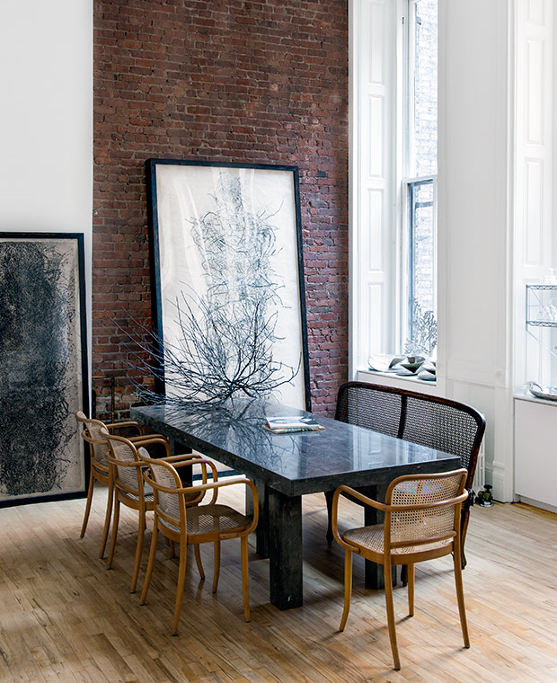
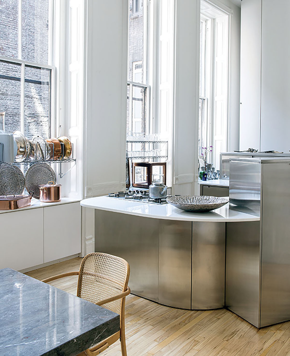
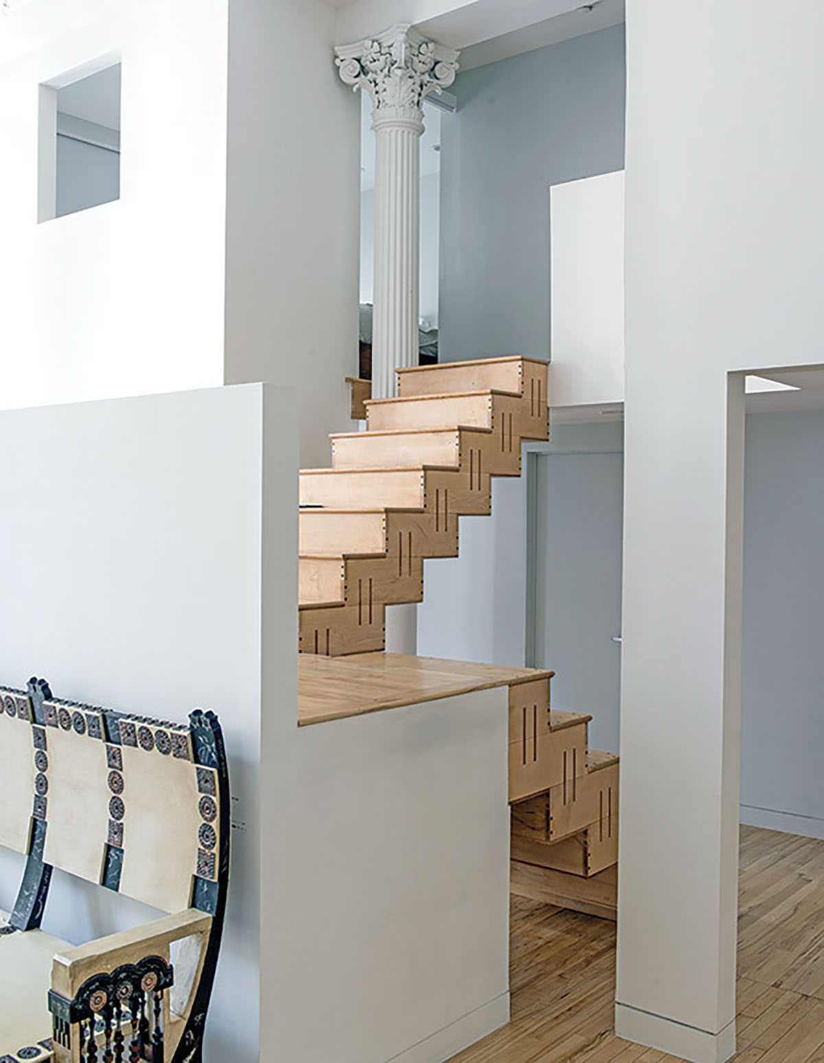
Anyway, shout out to the film’s Production Designer Jane Musky and Set Decorator Joe D. Mitchell for creating such a memorable space!
