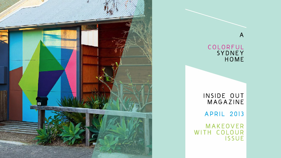
Happy Spring! In the April 2013 issue of Australian mag, Inside Out, this colorful split-level Sydney home is kicking off the season just right for me! The owner, Courtney, created a bright and inviting space for her family, but it also has the added plus of containing a separate home that she rents out. There’s a clever combination of amazing artwork, bold colors and creative solutions that make her home such a delightful place that’s full of soul.
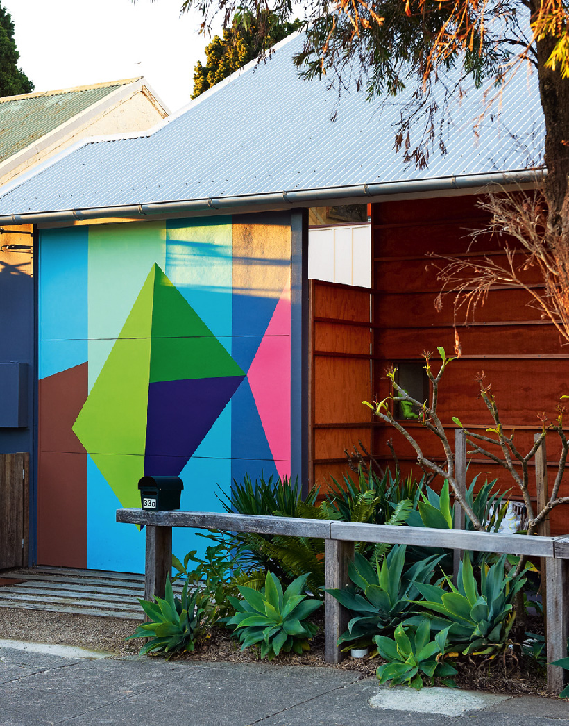
You can immediately tell that this is a special home from the entrance alone. Courtney commissioned artist Lousie Tuckwell to produce an eye catching geometric mural.
I had a chance to chat a little with Lee Tran Lam, the writer of this story for Inside Out. She shared with me an extra quote from her interview with Courtney regarding what her wants were from the architect, David Boyle:
“I asked David for two adjoining 3-bedroom houses, one to live in, one to rent out… that it needed to be a space that could accommodate my children and me quite comfortably… For me, this is a house for life, so it needed to be designed to suit the children and me at all ages and stages of our lives. And because it’s not a large house it needed to trick the eye into feeling more spacious than it actually is. David absolutely delivered to all these ambitions. I also said to him that I never wanted to wander into the house next door and think it was nicer than mine! He came perilously close to not delivering on that one, because the house next door is really lovely!”
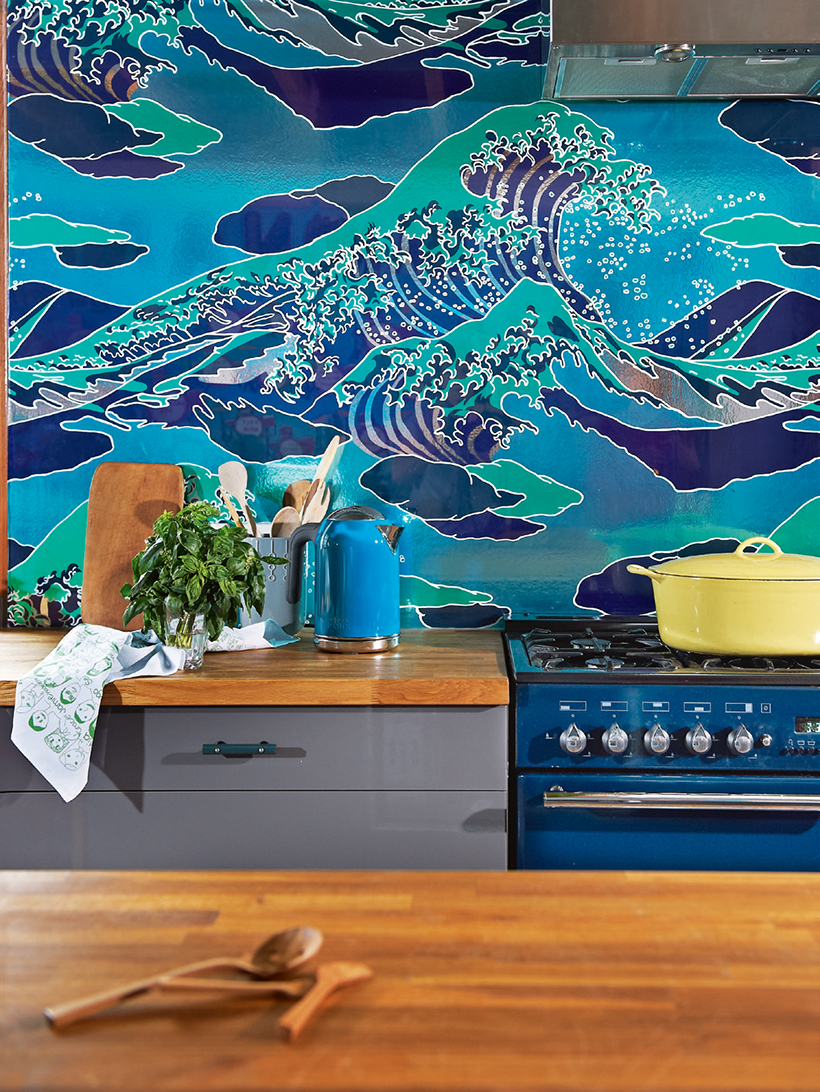
I was immediately drawn to the use of the wave wallpaper as a backsplash. It’s behind a sheet of glass and makes such a dramatic statement. Also, where do I get a blue oven liek that?! Yes Please! (the wave print “Onda” wallpaper is by designed by Flavor Paper, available here.)
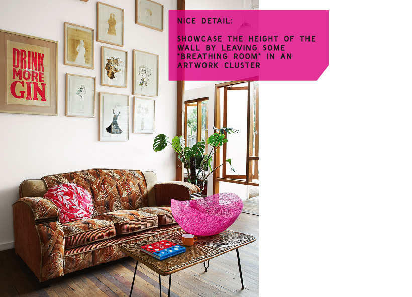
In the living room, I love gallery style wall of artwork above the couch. However what really makes it stand out to me is the fact that she took advantage of the height of the wall and left some blank asymmetrical white spaces in between the pieces. (artwork shown: Robert Rubbish, Joan Ross- the gorgeous hot pink bowl is by Emma Davies)
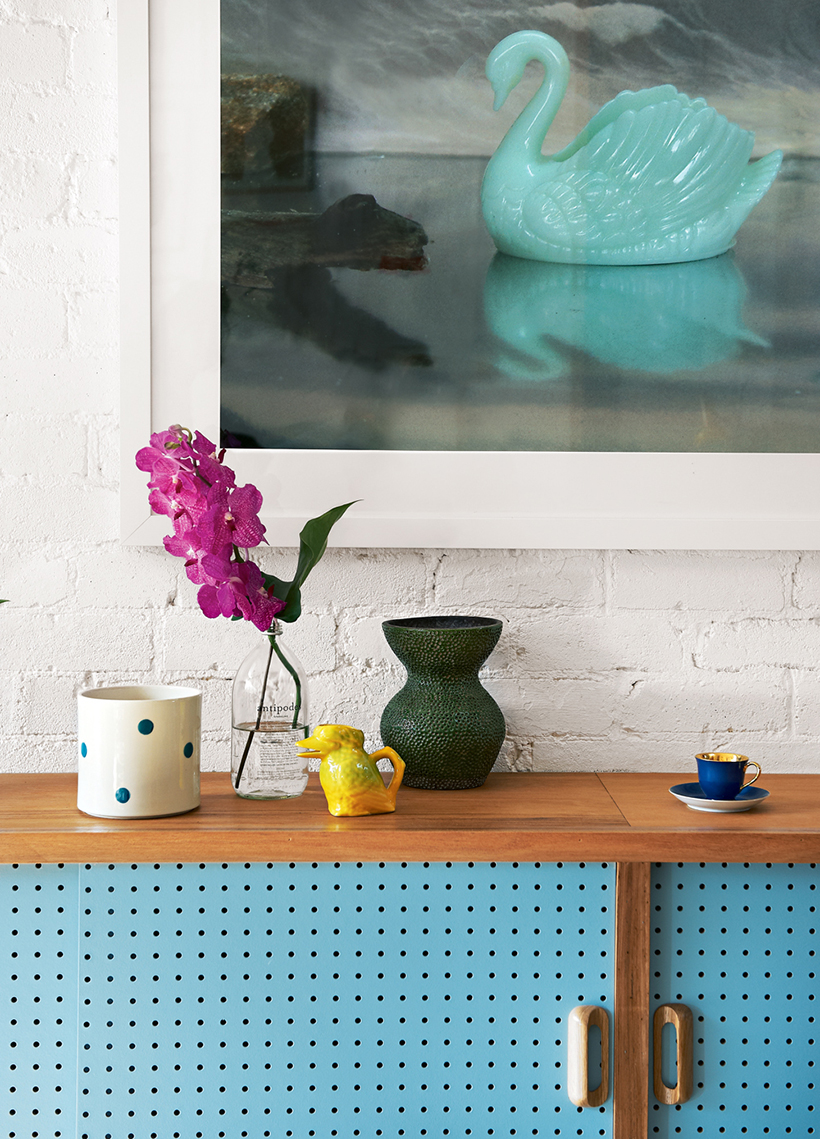
Another great feature is the use of simple painted pegboard for the doors of the built-in cabinets. They’re economical and practical, but also give a fun mid-century retro feel. (the artwork is by Elaine Campaner)
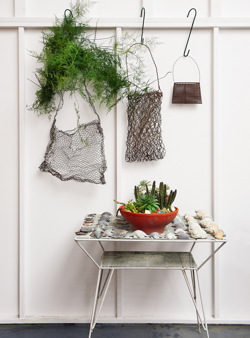
Finally- how cute is this little outdoor vignette? Just a reminder that you should treat your “outside” like your “inside”, using artwork and other personal touches. (the wire sculptures are by Lorraine Connelly-Northey)
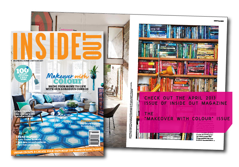
You can check out the rest of this story (including a bright sunny yellow bathroom that I didn’t show which you just have to see!) in the inspiring new April 2013 “Makeover with Colour” issue of Inside Out. (Now available digitally via Zinio, Google Play and Apple’s Newsstand)
All photos by Brigid Arnott, with Styling by Vanessa Colyer Tay
Images courtesy of Inside Out Magazine and special thanks to Lee Tran Lam
