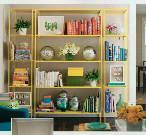
Nice shelving inspiration featured in the September 2011 Better Homes and Gardens. I like the modern/minimal construction, but it’s that pop yellow that really makes it a stand out. Also like how it’s against a light tan wall, (love the integration of the artwork in white frames into the mix of books and accessories- adds some nice contrast and gives your eye some places to focus). (photo by John Bessler)

