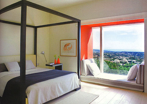
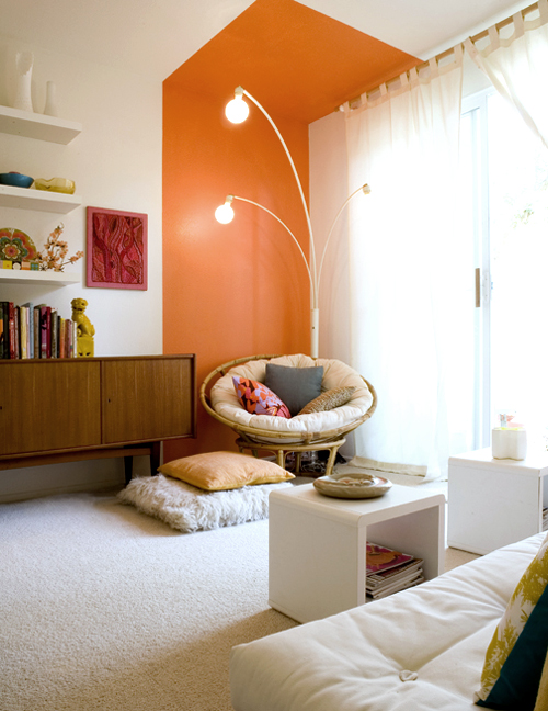
Another great shot from the August 2011 Elle Decoration UK. I was immediately drawn to the piece highlighting this modern home in Spain designed by Francisco Cortina. The house itself is filled with bold color, but it was this little window nook that really caught my eye. I love how the majority of the bedroom is in neutral tones, but the nook is painted top to bottom with a bright accent color. I also love how he carried the neutral tones into the cushions, using a graphic large scale grey and white stripe fabric. (photo by Montse Puig/Archivo Fotografico)  It actually reminds me of when I was decorating my downstairs bedroom. I used a similar idea of defining an area through color. I didn’t have a window seat type nook per say, but I wanted to create a cozy little space by the window. I just painted a huge block on the wall and also carried it up onto the ceiling.
  Coincidentally, I also used a bright orange. However, Cortina’s house has a waaaaay better view (sigh…yes please) (photo above by me)
