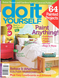
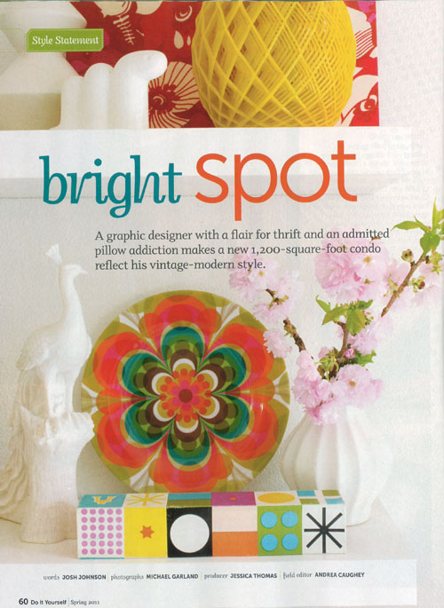
 So… I picked up the latest copy of DIY ideas magazine over the weekend, and was immediately drawn to this bright home featured in the issue. Hey… wait a minute… something looks really familiar. Hey… it’s MY house! and that’s Pepé! LOL- ok, ok… if you’ve been following my twitter for awhile, you might remember me tweeting about this. Here’s the scoop…
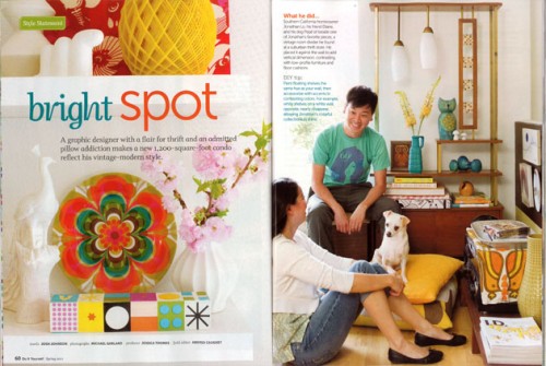 I was contacted early last spring (almost a year ago!) about potentially having my home featured in the mag. Then in April of last year, and two days of mild mayhem- a fun crew came and styled up my place. Then fast forward to this past weekend to me at the bookstore- and voila! There’s a fun feature in the new Spring Issue!
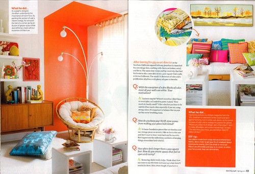 The whole experience was really interesting and a bit surreal for me. Now, as most of you know, I’m an art director by trade. I have art directed and styled many fashion and interior/home shoots, but this time, I was on the other side of the camera, and totally had to give up “control.”
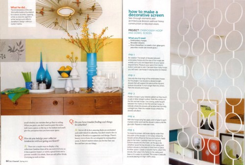 I have to be honest, the house you see in the magazine isn’t 100% what my house is normally like. The magazine definitely has a strong consistent image and the editors wanted to make sure the home would tie in nicely with the rest of the issue, but still be true to the spirit of my home. They sent out a really talented producer/art director, Jessica Thomas. I’m sure many of you will recognize (and have probably drooled over) her gorgeous work with other publications. Check out her site here. It was really fun to see her take all of my stuff and put them together in ways that I never would have thought about!
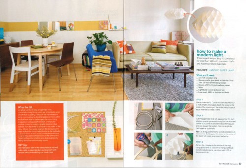 I guess it’s a good reminder that if you want to give your home a fresh or different look, you don’t necessarily have to spend any money. Simply move the things you already have and try them in different combinations. Take a pillow from one room and move it to another, etc… The only thing that really wasn’t mine was the bedspread and the flowers. At the time, my bedspread was brown (this is what my current bedspread is), and they kind of wanted some more color, so they brought that one in just for the shoot. Pepe liked the blanket as seen in the shot below, so I recommend focusing just on him, lol. (I’m not trying to be a stage dad , but… ok, Pepé is a natural supermodel, lol) I’m also not really a flower kind of guy, so those definitely had to be brought in. However, stylist tip: adding flowers to a space really livens things up- especially in a photo!
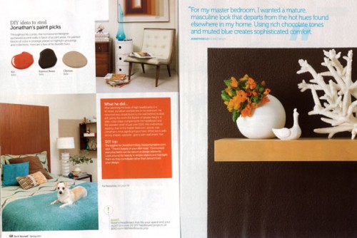 The feature showcases several of the DIY projects that I’ve done in my home. For example, the headboard in my bedroom, the retro light fixture in the living room (I show a step by step instructional) and also the room divider that’s in my stairwell (there’s instructions for that too). Here are some behind the scene shots:
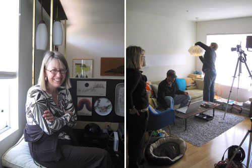 left: Andrea Caughey, the field editor that organzied the whole shoot. right: the photgrapher, his assistant, and Andrea getting things ready for another shot.
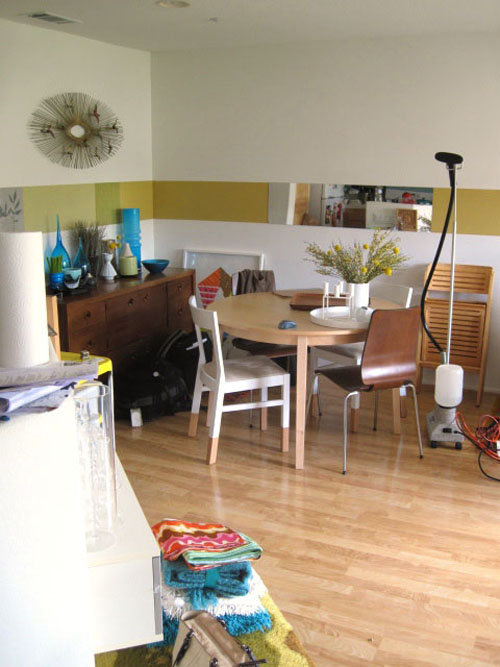 above: the chaos in between shots. (Actually my house doesn’t look to far from this on a normal day…)
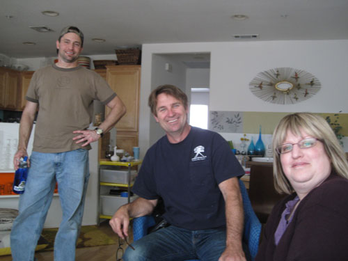 above: the awesome crew: assistant Matthew Meier, photographer Michael Garland, and producer, Jessica Thomas.
Anyway- I just wanted to thank DIY Ideas magazine and the entire crew again (oh and Josh Johnson for writing a great story and making me sound coherent!) for featuring my humble abode. If you’d like to get a closer look- the issue is out on newsstands now!
