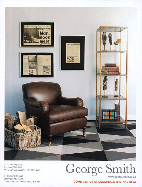
 I just LOVE this image! It’s actually an ad for George Smith. It’s very quiet at first, but then as I looked at it more, I noticed all the subtle layers… (more)It’s a perfect mix of classic with modern (♥ the graphic rug and old books on the bottom with the bright color blocked spines!), masculine with glamour (♥ the leather club chair and the gold metallic shelf), and just overall, very refined but still infused with a little wit and humor (♥ the sculptures, which I originally thought were ethnic face masks or something, but upon closer inspection are actually old wooden shoe forms!). Also love the black mats in the picture frames and the cut out newspaper headlines. Some great ideas ♥♥♥!! You know, the whole “turn your outfit into your room” thing- Can’t you totally envision the opposite here?- ie. what the outfit could be, based off this room? I’m seeing a guy with a cool tweed jacket with jeans and a button down shirt, and then fun Paul Smith socks… what about you?
