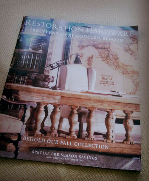
 It’s been about a year now (scary how time flies) that I first read about Restoration Hardware‘s “rebranding” from this great post over at Apartment Therapy. It’s been interesting to see throughout this time, the gradual transition the company has been doing. Last week I received the latest catalog, and in the intro, it says “…we’ve destroyed our precious iteration of ourselves, clearing the way to express our brand in a never-before-seen fashion…” The headline on the cover is “Reinvented. Remodeled. Reborn.” I noticed recently that the Restoration Hardware closest to me at South Coast Plaza had begun taking steps to update their store interior as well, and this week I finally got a chance to swing by and check it out…
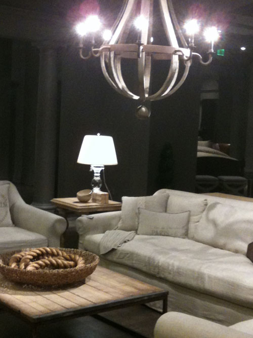
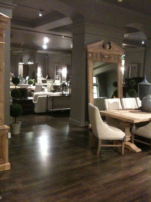 Whoa- They weren’t kidding when they said they had “…completely destroyed…” their old look. My first impression was really affected by how dark the atmosphere was. Not necessarily “dark” in a gloomy way, but just… dark… and oddly, very quiet. It’s much more sophisticated and they’ve really gone for a “vintage”/european world traveled look. Words that came to mind were modern castle/chateau- chic. Before, I always got this east coast Nantucket/Hamptons vibe, but now gone are the sage green and white trim walls. They are replaced by a really dark brown/grey tone. Everything is muted or in neutral tones of woods and creams, and metals. This particular space at South Coast also felt really stark (maybe they’re still getting stuff in?)
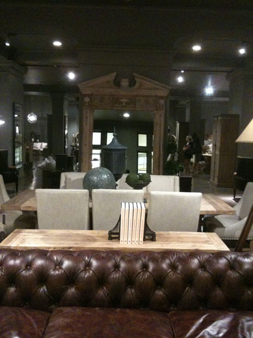 I’m a bit on the fence about the whole thing. On the one hand, I kind of like this new look. There are a ton of really beautiful things. Looking in the catalog, I’m totally gaga over this 1950s Dutch Shipyard Shelving. They’ve definitely upped their prices, but hopefully at least they’ve upped the quality as well. These are definitely investment pieces. Although the overall look isn’t really my style, I do really like a lot of the things they are carrying. I also appreciate that they’ve made a strong stylistic statement, since their previous look was a bit… boring? I do miss their great towels and they always had a fun selection of vintage-y toys, gadgets, and tchochke’s. Also it’s interesting to see that in the catalog and on the website, the rooms and styling are shown in brighter settings. I think it’s a warmer and more inviting presentation as opposed to the darkness of the South Coast store. (Maybe it was just the weird track lighting that made it feel so dark)
 Overall, I think this is a bold step for them, I’m just curious how it will work or resonate with the public. Will enough people be buying these pieces for it to be profitable? Anyway- for those of you that have a Restoration Hardware near you or have looked at the latest catalog, I’d love to hear your thoughts on this change. Comment below!
