 The September 2010 issue of Martha Stewart Living is their annual “HOME” issue. It features the newly remodeled apartment of their decorating editor, Kevin Sharkey. Apparently the remodel took two years to do, which is actually nice to hear, since this isn’t a quick fix makeover show and it reminds us to not feel the pressure of having to “get it done” right away. I have to say, the results are quite stunning. There’s a few highlights that he did that I really loved and could see as quite applicable and easy to incorporate… (more after the jump)
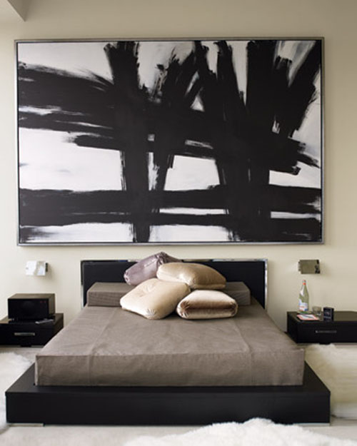
 I think one of the most striking features is the bold graphic artwork in “the style of Franz Kline“. It really sets the tone for me and the contrasting black and white could add a big punch of modernity to a lot of different settings. I personally have a weird phobia about putting anything big like that over my bed, but I love the overall look.
 I am totally obsessing over the ginormous piece of “fools gold” or pyrite. I was at an antique store in Old Town Orange recently and spied a small chunk of this in a display case. I was so drawn to it, but it was too expensive. Now seeing it used in this photospread, I can’t get it out of my head. I also love that he stuck it in his new closet (which is to die for, but I could never keep it that clean and organized). It looks so great sitting on a piece of lucite. Now I am on the hunt for an affordable piece…
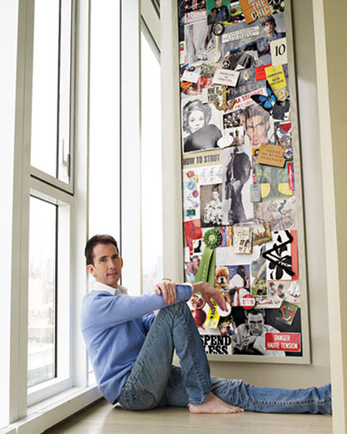
 Finally, I really loved the large “mood board” he had. I’m sure many of you have a board like this around your work area. I’ve always had a bulletin board covered in clips by my desk, but I love the idea of displaying it in a different area and really treating it as an ongoing piece of evolving collage. Love having it in a nice formal frame and also oversized in scale. It reminds me of the lobby at the Palihouse Holloway Hotel here in LA, where on a central column, they covered it in cork and tacked cool pictures and ephemera. Talk about easy to do artwork!
Check out before and afters, and a virtual tour here, and more shots here. (photos by Paul Costello) What did you think of Kevin Sharkey’s pad?
