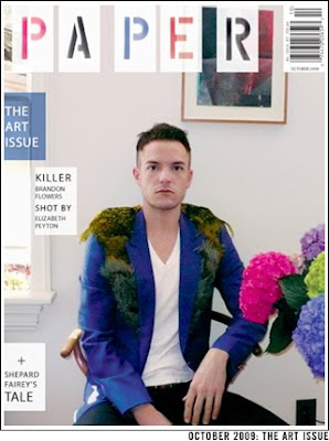
 I’m not sure what it is, but I’m completely drawn to this cover of the October 2009 Paper Magazine. Love the weird bright pops of color in the flowers, the neutral background, their new stencil logo, the offset white blocks with type inside, and Brandon Flower’s styling (shot by Elizabeth Peyton)- it all just works together and feels so fresh! Read the article here.
