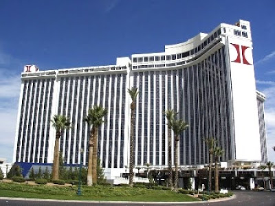
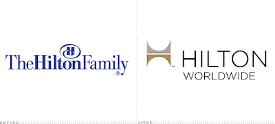
…And in random graphic design news… did anyone notice that Hilton changed their logo? I joined the Hilton rewards thing awhile back since I travel frequently- and saw the new logo. I remember back in the day, the old Hilton logo, (which I actually liked)- the big simple red “H”.  Then somewhere in the 90’s? it changed to the blue logo with the swirly/curly thing- which was like… ok.. whatever. But now it’s changed again- and oddly, it’s very similar to the old one- but they turned it sideways?
  I guess I like it better than the curly/swirly version- and I like the clean sans serif font- but- why not just go back to the original then? Anyway- read more about it here at the Brand New blog.
What do you think? Do you like the new logo?
