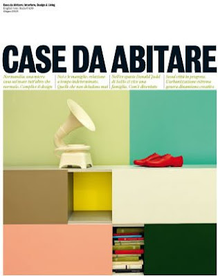
 Remember that colorstory I was obsessed with a few months back? Well, the colors on this gorgeous cover of the June 2008 Casa Da Abitare feel like a natural progression from them. I guess they could be the Summer version? I love the unexpected combination of the muted peachy-salmon with the yellow, tan, sawgrass green, and hunter green, but it’s the muted turquoise that really seals the deal for me. Has a slight vintage 60’s feel… love it.
