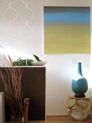
Recently I added a new piece of artwork to my stairway wall. It’s a pretty substantial piece (its the one on the left above- It’s really long horizontally, and I love the 70’s modern city scene with the brown/rust sun. Consequently, when I took a step back, I found that it didn’t work so well with one of my existing pieces. (see below- the existing painting is the blue gradation one) The piece that was now affected was one that I actually made myself. There’s no real deep emotional attatchment to it. At the time, I just wanted to put something up to bring in some color to the wall.
 So, my thought was to actually modify the existing art, to make it work a little better with the new piece (uh oh- watch out- Jon’s gettin’ “artsy”, hehe). I mean, the canvas is the perfect size, and it’s still in great condition. No need to waste good canvas right? Looking for inspiration, I always find myself paying attention to artwork and details in the background sets of some of my favorite style movies. One example is in the beloved film, Pillow Talk. I took some screen caps of some artwork in the film that caught my eye. It’s interesting how well these pieces hold up nearly 50 years later…
So I’m definitely loving the more abstract splotchy concept, but also LOVE the clean graphic one at the end. Love the grey color, and thinking maybe I need some gold… hm… we’ll see what happens… stay tuned…
