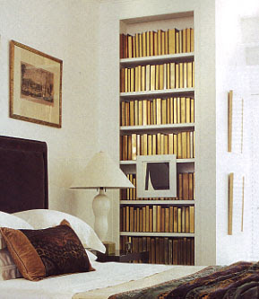
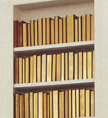
Recently picked up the latest July/August 2007 Elle Decor, and noticed a few interesting things- One- I am soo jealous of the house of Trina Turk. I posted it on AT:LA. Soooo lovely. Next, I saw two more interesting treatments for books in a bookcase. You’ll recall the white on white thing I mentioned before- Well, I spotted this detail in this image for Lauren Henson’s home. At first, I was intrigued with the gold color on the spines, and thought they had done something similar to the white slip cover thing- but upon closer inspection, I realized that all the books were facing backwards- with the spine to the back of the case. This seems really weird to me, and I wonder if it wasn’t just something done for the photoshoot. How would you know what book it was without seeing the spine? I do like the visual look, but just not practical. Unless you never planned on reading them and they were purely for decoration. I do like how the painting sits on top and in front of the bookcase. I’ve seen it done before, and think it’s a great way to add some interest to a bookcase.
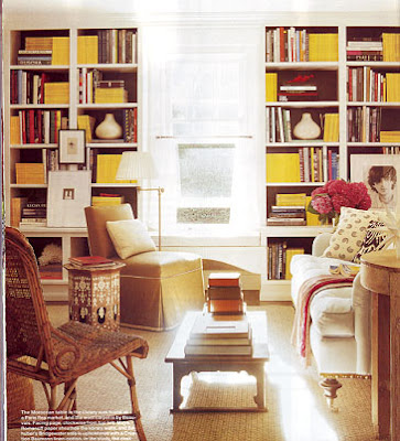
And then a few pages later, there’s another cool bookcase idea. This time involving visual “colorblocks”. Here, they’ve intentionally mixed their collection of what seems like National Geographics, and clumped them into big groupings that form these yellow rectangular graphics. What a great way to utilize a big collection ! It adds so much punch and color. Sadly most magazine spines are hardly ever the same color, but perhaps a large book collection of similar colored spines could be used to achieve a similar look. There’s been much blog talk of arranging your books by color, but perhaps instead of a simple rainbow effect, you could mix it up into color blocks? What do you guys think?
