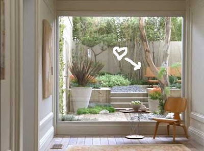
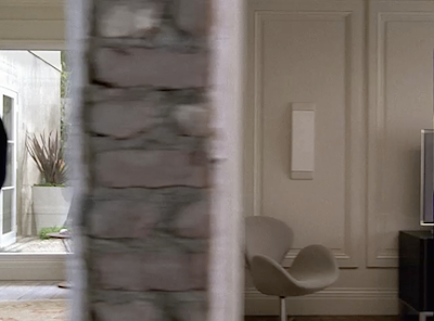
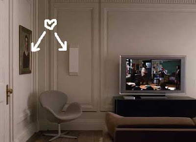
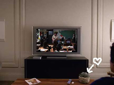
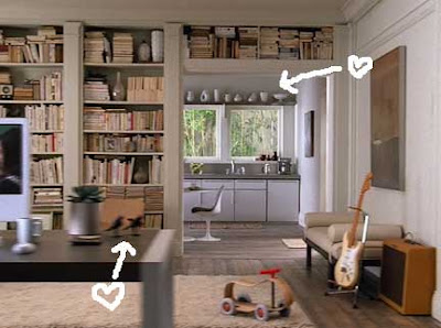
 Ok- yeah the new Apple TV is cool and all- but have you seen the commercial for it? I think the real star should be whoever designed the background set. It’s so amazing! The color scheme is so pared down to grey (swoon) neutrals, yet, it still feels warm and “lived in”. I love all the subtle touches they threw in too, like all the funny props- ie. The toy in the study, the little bird scupltures on the desk, the great white vases in the grey kitchen, all the coordinated books, the weird portraits on the wall in the living room, even the little succulent plant on the coffee table! No detail was spared- even the matching white washed/faded bricks when the camera pans through the wall. Plus- can we talk about the speakers (I think they’re speakers) in the living room set up? They look like gorgeous sconces, and blend right in- Also- I am in love with the backyard set they have too. Where in the world did they get that bench?! This probably is not a real house but I totally want to live there! View the commercial here.