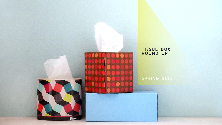
I’ve always said that this blog is about “good design of any kind”, and I think tissue boxes fall into that category! After my recent New York trip, I unfortunately picked up some sort of bug and was hit with a full blown cold. This resulted in numerous trips to the store to stock up on tissue boxes and it struck me how dismal the state of tissue box graphics are out in the market. However, there were a few that were actually pretty pleasing so it prompted me to do a little more thorough search and here are my favorites I found available (locally to me) this season.
By far, Kleenex had the best selection. To me, they’re the most recognized brand so it’s nice to see they are taking tissue box graphics seriously. Their “Expressions” collection looks to be their trendiest group, and the designs are divided into the different shapes of boxes: oval, upright, and the longer box “medium count”.
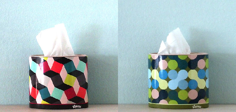
My favorite from Kleenex is the “Cubix” design, part of their “oval” Expressions collection. Another design I liked in the “oval” collection is their “Jacks”.
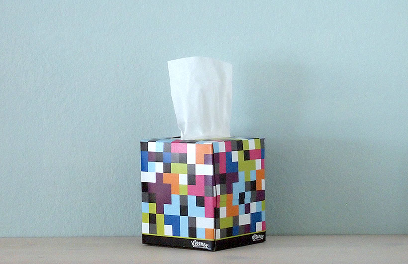
In the “upright” category, I really liked the “pixel” design.
I checked out other stores to see what options they had.
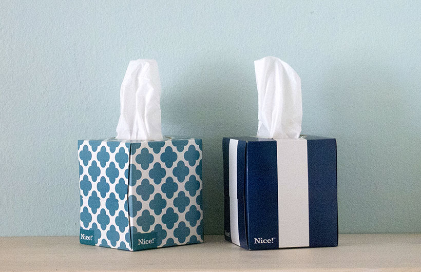
Walgreens had several designs for their their own “Nice!” label of facial tissues. I liked this simple navy with white stripe, and also this more decorative motif.
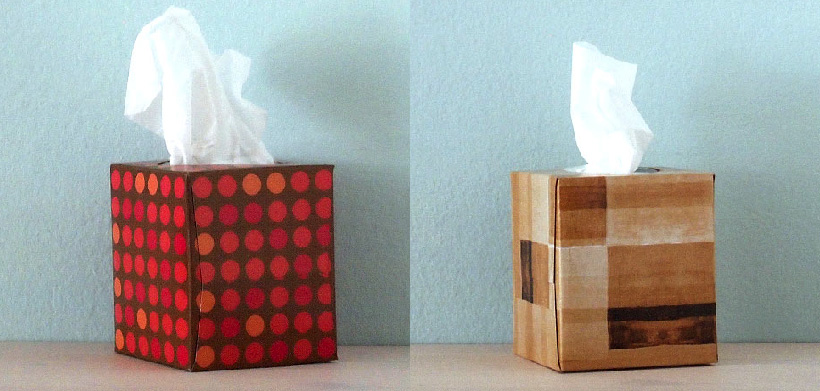
Both K-mart and Walmart have their own private label collection of tissues as well, however I only found one design from each that I liked. From Walmart, I thought this polka dot pattern had a great color combination, while K-mart had one that reminded me of woodgrain.
Despite all these different motifs, I think the design that I seem to prefer out of all of them is actually no design at all.
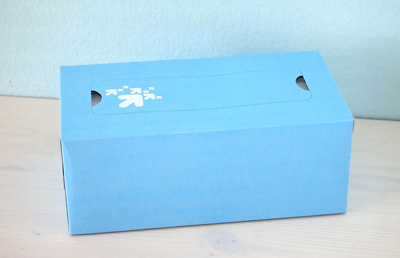
Target’s own label of tissues has some random designs on their boxes, but they also offer just some with plain solid colors. These plain solid colored boxes have no graphics visible (once you remove the top opening strip). I found the simplicity of the solid colors to be the most appealing. Sometimes the most basic is also the best!
Have any of you found any interesting tissue boxes with nice graphics?
