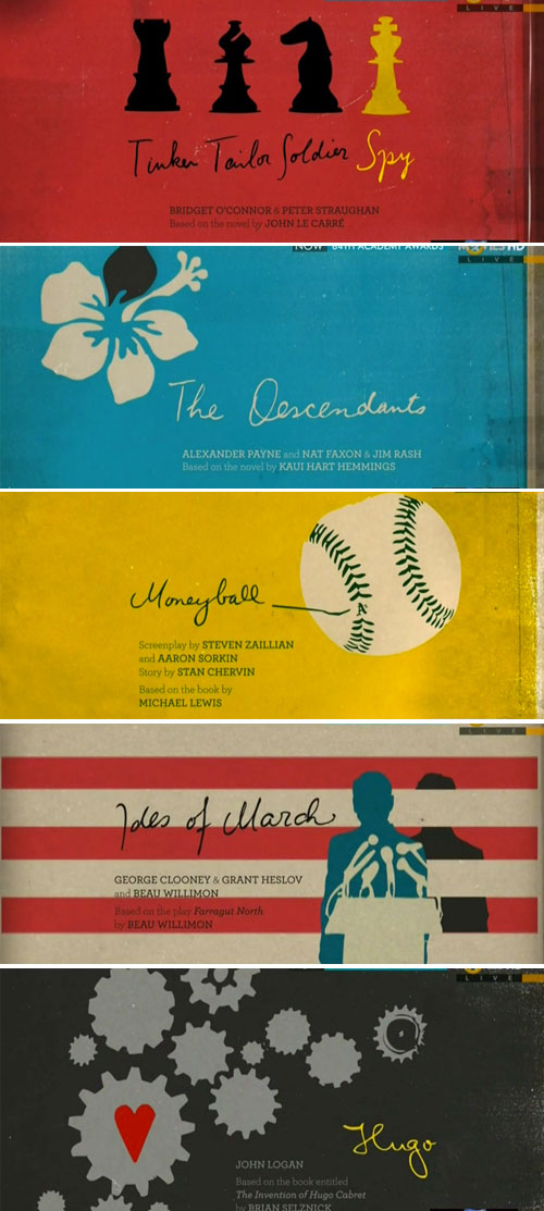
So did any of you catch the Oscars this weekend? Personally I thought the show was pretty boring, but I guess most awards shows are. However, one thing that grabbed my attention were the visuals they used to present the nominees for Adapted Screenplay.
I loved the slightly retro and simple graphics paired with the hand written script. Turns out they were created by the LA branch of The Mill with Henry Hobson and Tom O’neill as creative directors. Kudos guys!

