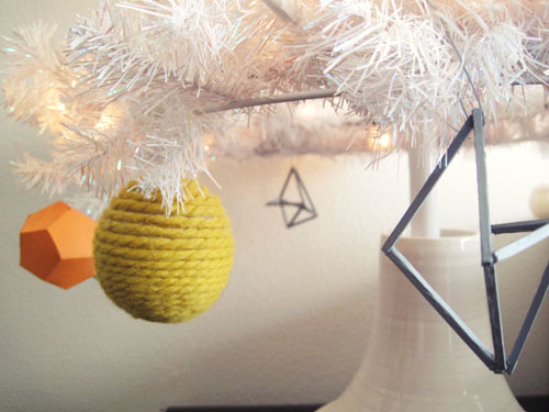
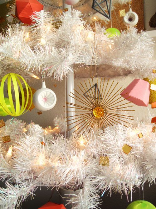
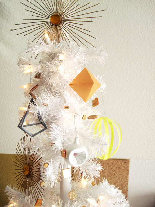
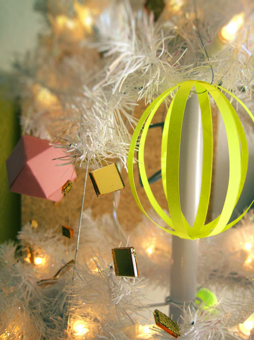
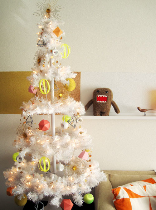
 Woo hoo! It’s Christmas time! So here’s how my tree turned out this year. A fun little mix of new paper geometric shapes, combined with last year’s gray faceted sculptures, and the vintage-y gold starbursts and white spray painted ornaments that I’ve been using for the past few years… all pulled together with a quirky color palette of tones of oranges, mustard, muted pinks, and a shot of fluorescent neon yellow!
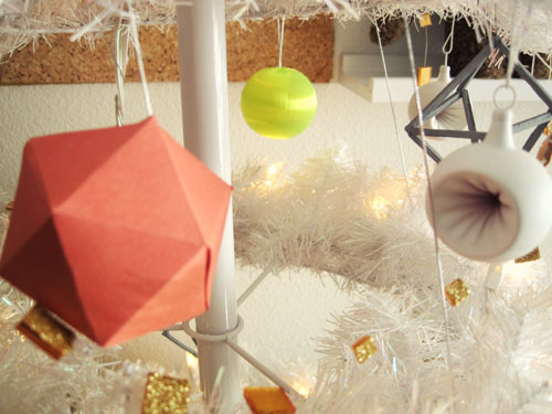
I’m really enjoying the color palette. I know it’s not for everyone, and it’s very different for me as I generally don’t go for these softer tones, but it still feels really festive and I can’t get enough of the neon yellow! It really set the tone for everything else in the house, including my dining table centerpiece and gift wrapping -which I’ll show you next! stay tuned!
