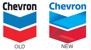
 Last night, a common plight for most so cali folk and all who live in suburbia, I had to refuel my gas tank. I was running on fumes, so I stopped at the closest station that happened to be a Chevron. I suddenly noticed that their logo changed. I’m sure this is probably old news, but it hadn’t struck me until now. It’s weird. They added these gradients and I guess it makes it look like ribbons or something. My question is… um… why? What was wrong with the old one? To me, the old Chevron logo is a classic one. Iconic, simplistic, and highly memorable. I could understand slightly modifying the typeface, but the logo itself now seems kind of…muddy? with the new gradients. Granted, its 2007. Capabilities have come a long way, and with everything going digital, reproducing these gradients probably isn’t a big deal. Clients are constantly coming to art directors and graphic designers to “redo” their image. Often times, a logo/brand mark is the first step. But I’ve always been of the school that changing an already established logo isn’t necessarily always.. necessary. Sometimes it is, sometimes it isn’t. In this case, I happen to think this logo change wasn’t. But that’s just my mundane observation. After a little digging, I found several blogs have been discussing this. here and here are two. What do you guys think?
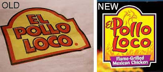
Anyways… this weekend, I also noticed another company has recently changed their logo, El Pollo Loco. (love their twice grilled burrito by the way) This redesign I’m not really bothered by, although personally the “El” seems kinda after-thought-ish. Anyways, I guess much like your home or your wardrobe, a little change and refreshing can be needed, and big multi million/billion corporations are apparently not exempt.
