
 This month’s Martha Stewart Living is the “decorating issue” and features her amazing kitchen. Just as I was starting to ween myself of my gray obsession, Martha comes and pulls me back in. I love the images of her gray toned kitchen.
  It feels so fresh and warm with all the textures they put in. The stainless steel, the interesting patterns on the cabinet drawers, the organic glazes of the pottery, the veins in the marble sink… and I love the pops of white. She calls the paint she used on all the wood “Bedford Grey” and apparently this color goes throughout her farm.
  I also love how the fruit (although just props) totally comes out as an accent. A kitchen is all about food, and with this palette, any food visible really becomes the star. Actually, in retrospect, Martha was the first person that started my gray kick. Back during her Martha Stewart Apprentice show, I became fixated on the dark gray paint that was in her “conference room” set.
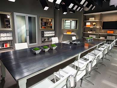 Currently, I have a few pops of gray in my house, but I think I may need to figure out a few more ways to incorporate it more… hm…